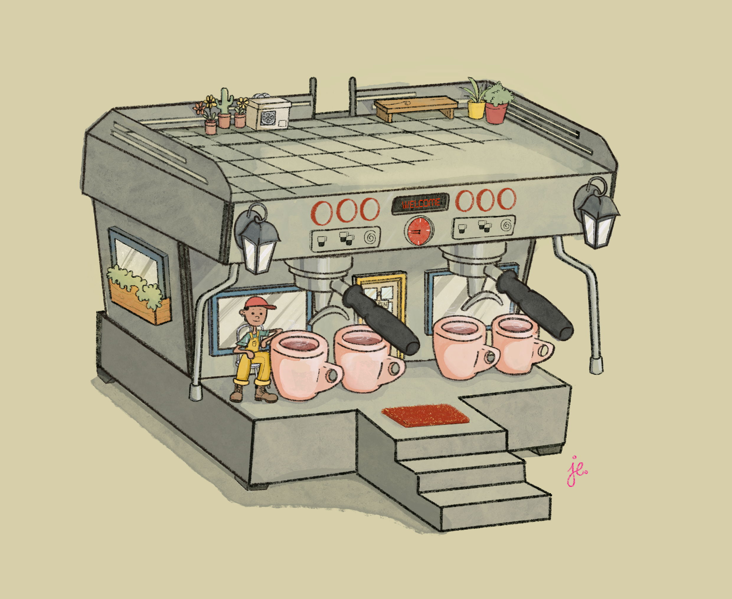
The Barista Who Cares
Time-lapse from my simple sketch to the final product at the end of this post!
This art is something that I’m really happy about because it is actually the first thing I ever properly did on Procreate. I was only using it for sketches because I felt so disconnected drawing digitally. Finally, somehow, it just clicked and I fell in love with the conveniency BUT I still prefer how ink and lead feels on actual paper.
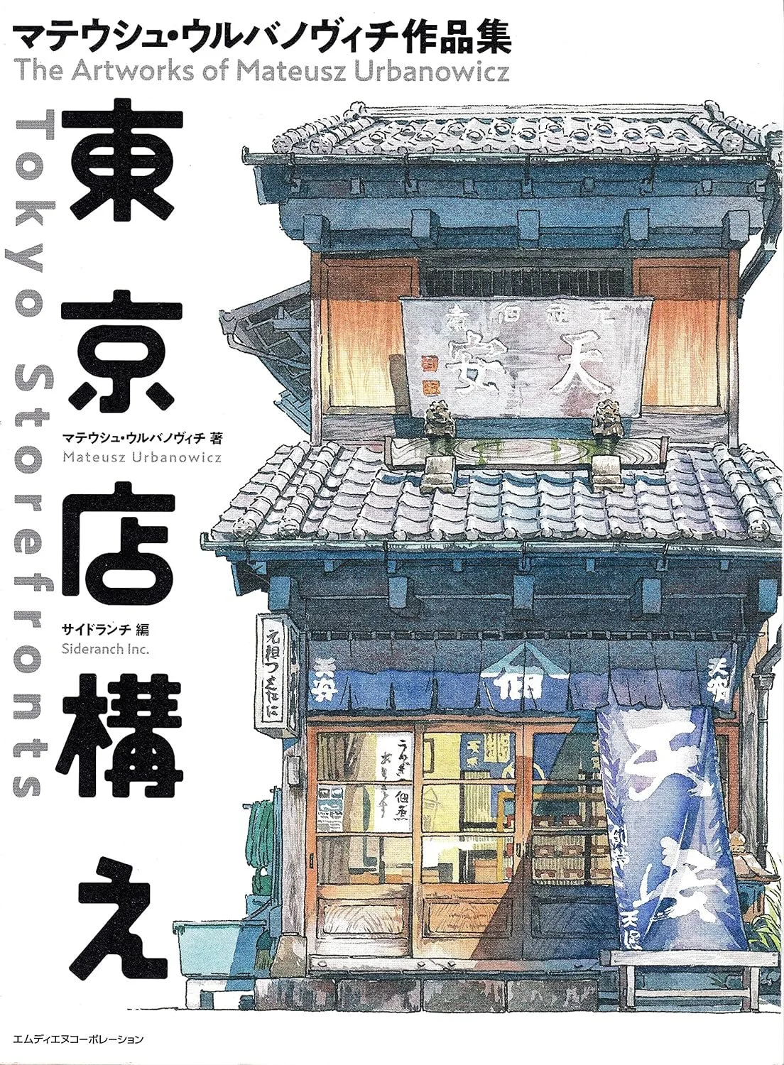
Figure 1.1 - Tokyo Storefronts - Mateusz Urbanowicz,
At the start, my idea was to just do a drawing of the machine but as a cafe. I used La Marzocco’s machine called Linea PB model as a reference, mainly because my fiancé works with them now.
This idea surfaced from my fascination over storefront drawings, especially the Japanese ones.
I studied a lot of Japanese storefront drawings and got a book by Mateusz Urbanowicz which helped me a lot (See Figure 1.1)
I didn’t wanna just draw a shop, so I decided on making something a little playful. It took me awhile to decide what to keep as the actual part of the machine and what to change into something else that adds on to the idea. I went through a lot of changes and back and forth with this one.
Normally, storefront drawings don’t really have people in them but I added a fellow outside hanging about so it wouldn’t feel so empty. My initial idea was to make him a patron or something but actually, he seemed much more fitting as a part of the establishment instead! (See Figure 2.1)
Figure 2.1 - Meet the barista who cares
Once I started to see the character that way, I think it started to have a more in-depth feeling personally. It reminded me of the people who actually care about how their coffee comes out, not only for the customers they’re serving but for themselves.
I loved doing up the smallest details and subtle features— the coffee smoke, the carpet texture, the barista’s attire, the items on the rooftop, etc.
I’m glad with how the boots turned up! I drew the footwear as sneakers in the beginning then my partner complained (I told him I based this fella on his likeness). When it’s that small, I usually worry about how muddled the lines and details can get.
Another thing I really enjoyed was playing with the colours. Honestly, choosing a colour palette is something I struggle with when I draw. It’s more obvious when I’m painting but here, I think I did pretty alright. Although, I would want to change it and find a more apt colour scheme. There are features on Procreate and Adobe Illustrator that can help you extract a colour palette from an image of your choosing.
One thing I’d want to change or work on is an alternative design to the WELCOME text. For now, I’m gonna leave it as it is.
Do check out the time-lapse video below!


